Wednesday, November 6, 2013
Friday, November 1, 2013
Wednesday, October 30, 2013
Wednesday, October 9, 2013
Friday, October 4, 2013
Thursday, October 3, 2013
Tuesday, October 1, 2013
Monday, September 30, 2013
Wednesday, September 25, 2013
Mix & Match

For this assignment I created this new person by using Maddy's head as a base and adding Holly's lips, Rachel's nose and Erin's eyes.
Friday, September 20, 2013
Extreme Makeover

Hollywood Version
Tools & Techniques:
·
The
background was added by making a copy of the original image and layering it
over top of the Hollywood picture. On this new layer I used the magic wand tool
to delete the background revealing the image beneath. The eraser tool was used
to clean up the edges.
·
I
used the surface blur filter to even out the skin tone. The colour of this
layer was also corrected by adjusting the colour balance and hue/saturation.
·
I
changed the eye colour to a more vibrant blue by selecting the area with the
elliptical marquee tool and painting the area using the paint brush with the
opacity turned down.
·
Eyeliner
was added around the eyes using the paint brush tool. It was then blended using
the smudge tool to make it look more natural.
·
I
whitened my teeth by zooming in and using the paint brush to paint over them in
a low opacity white.
·
The
lip colour was changed by selecting the colour using the eyedropper tool and
painting over them. I also adjusted the colour balance on this layer.
·
The
burn tool was used to darken the hair colour.
·
The
necklace was added using the magic wand tool. The chain was then extended using
the rubber stamp tool. To make the necklace look more realistic, a layer of
shadow was created underneath by painting under the necklace and using the
smudge tool to blend the area. An earring and nose ring were added by using the
rubber stamp tool to replicate one of the diamonds.
Cartoon Version
Tools &
Techniques:
·
Once again, the background was created by duplicating
the original picture and then removing areas with the magic wand tool and
eraser to reveal areas underneath.
·
All of the colours in the cartoon version were taken
from the original image using the eyedropper tool.
·
The areas of colour were created by selecting areas of
the original image using the magic wand, magnetic lasso or polygonal lasso
tools and filling them using the paint brush.
·
Once they were painted, adjustments were made to the
colour balance on the skin and hair layers to change the colour slightly.
·
The smudge tool was used in many areas, including in
the skin and around the eyes, to blend colours together and make smoother
looking transitions. The blur tool was also used for this purpose.
·
The shape tool was used to create parts of the eye.
·
Changes to opacity were made in many places,
especially on the skin and nose layer, to make the areas look more blended.
Older Version
Tools &
Techniques:
·
The wrinkles for the face and neck were taken from
photos using the polygonal lasso tool and incorporated into the image.
·
For the neck, the colour balance and hue/saturation
were adjusted to match my skin tone. Parts of the image were then erased so
that it was the same shape as my neck. The rubber stamp tool was used to
duplicate the texture and age spots in the image and continue them on the rest
of my skin to make the image blend in.
·
The image for the face was scaled and parts were
erased to make it the same shape as my face. The eyes and mouth were also
erased from this image so that mine could shine through. The areas around these
openings were blended using the smudge tool, along with the area near the
hairline. The rubber stamp tool was also used near the hairline to continue
some of the wrinkles.
·
For the mouth, the lips looked too young so I made a
copy of just the mouth to go under the face layer. On this layer I adjusted the
colour balance and hue/saturation to make the lips look a little more blue. An
angled strokes filter was also applied to make the lips look more chapped.
·
To clean up some of the edges a duplicate was made of
the original photo and was placed above all of the layers. I then erased the
face and neck areas to reveal the other layers. A duplicate was then made of
this layer in order to change the hair colour.
·
On this new layer, I changed the hair colour by using
the dodge tool. The paint brush was also used to apply a gray colour at a low
opacity. I alternated these techniques until I got the colour I wanted.
Tuesday, September 10, 2013
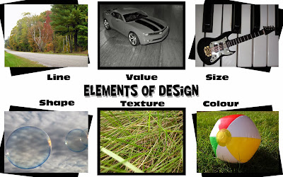
Elements and Principles of Design
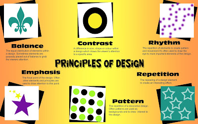
Principles of Design
I chose to use black and white boxes to frame the images in my design
and add some contrast between the designs and the background. All of
the boxes are the same size, but are on different angles to draw
interest to each one. I chose to use a coloured gradient background to
contrast with the text and boxes and make the poster more
eye-catching.
and add some contrast between the designs and the background. All of
the boxes are the same size, but are on different angles to draw
interest to each one. I chose to use a coloured gradient background to
contrast with the text and boxes and make the poster more
eye-catching.
The reason I decided to make my design look like
it was made on lined paper, was because the elements of design are used all the
time in things like schoolwork, which lined paper is used for, without us even
realizing it. I chose to use vibrant colours for the images and black for the
writing against a white background for my piece, in order to make the images and
the explanations stand out against the background and make them easier to
read/see. I placed them in two separate lines underneath the titles because the
human eye naturally looks from left to right in a straight line, so I made
looking at the images and explanations as easy as reading.
Subscribe to:
Comments (Atom)


