Elements and Principles of Design
Principles of Design
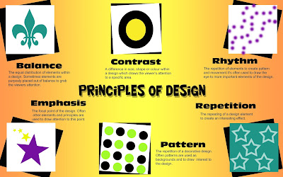
I chose to use black and white boxes to frame the images in my design
and add some contrast between the designs and the background. All of
the boxes are the same size, but are on different angles to draw
interest to each one. I chose to use a coloured gradient background to
contrast with the text and boxes and make the poster more
eye-catching.
and add some contrast between the designs and the background. All of
the boxes are the same size, but are on different angles to draw
interest to each one. I chose to use a coloured gradient background to
contrast with the text and boxes and make the poster more
eye-catching.
The reason I decided to make my design look like
it was made on lined paper, was because the elements of design are used all the
time in things like schoolwork, which lined paper is used for, without us even
realizing it. I chose to use vibrant colours for the images and black for the
writing against a white background for my piece, in order to make the images and
the explanations stand out against the background and make them easier to
read/see. I placed them in two separate lines underneath the titles because the
human eye naturally looks from left to right in a straight line, so I made
looking at the images and explanations as easy as reading.


No comments:
Post a Comment